
At the start of 2022, I was tasked with rebranding a small biryani business. For anyone who doesn't know, biryani is a popular south asian dish of rice and meat (or vegetables if you're like me). My client reached out and asked if I would be willing to help them keep the heart of the company but also give them more of an identity.
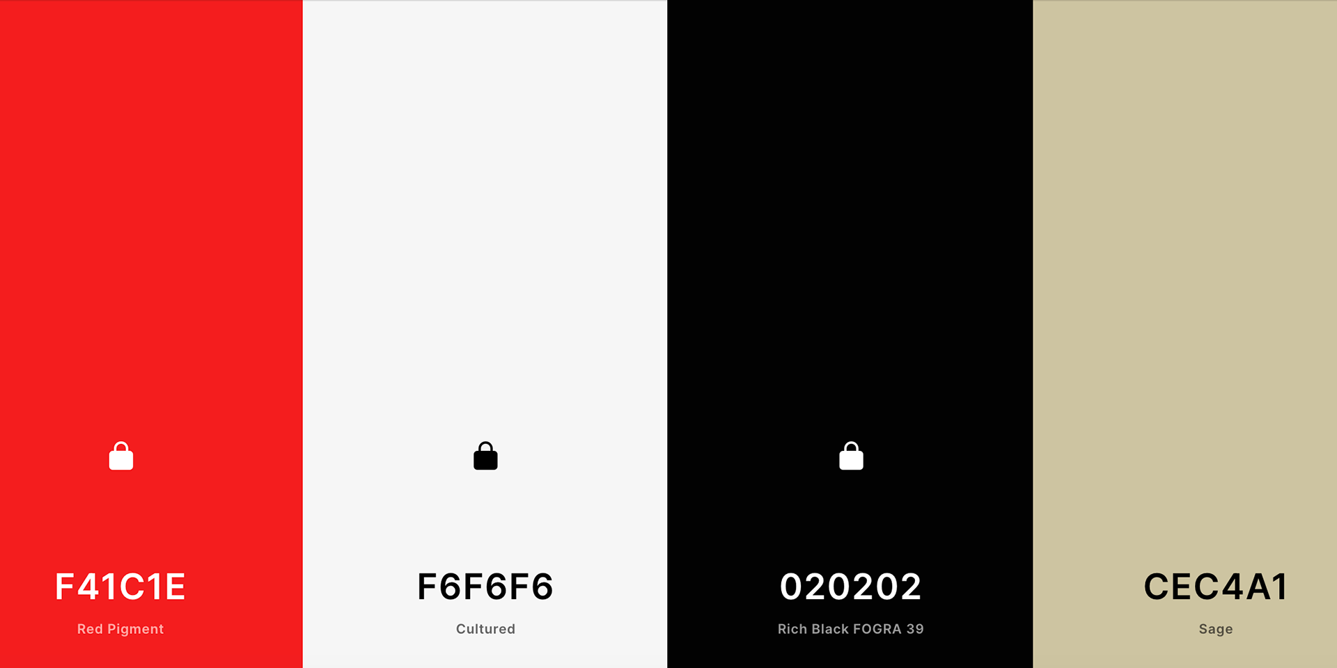
Now since there was already a base to go off of, my first step was to expand and solidify the color palette. I was already handed the red and black for text color, but I wanted to add some lighter neutrals to really make the red pop off the background.
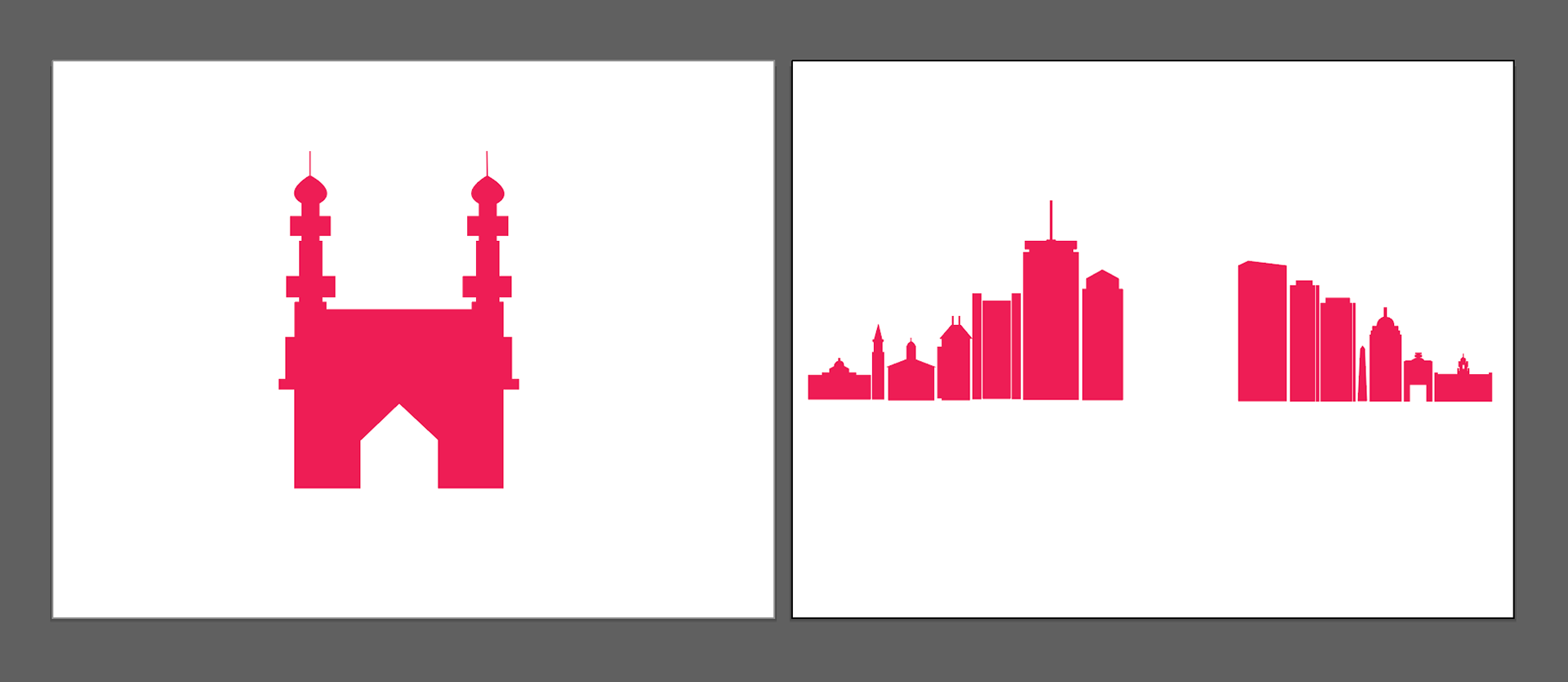
From there, I had to decide how to personalize the logo. As my client was from an Indian heritage, and the city of "Boston" was in the name of the business, it was a no-brainer for me to use some architecture illustrations. I fused the Boston skyline with the silhouette of the Charminar monument in Hyderabad, India as those signified my client's two homes.
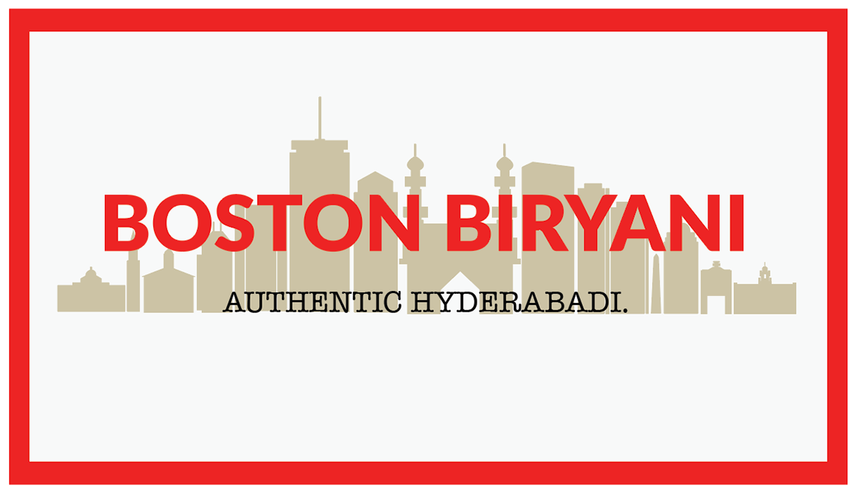
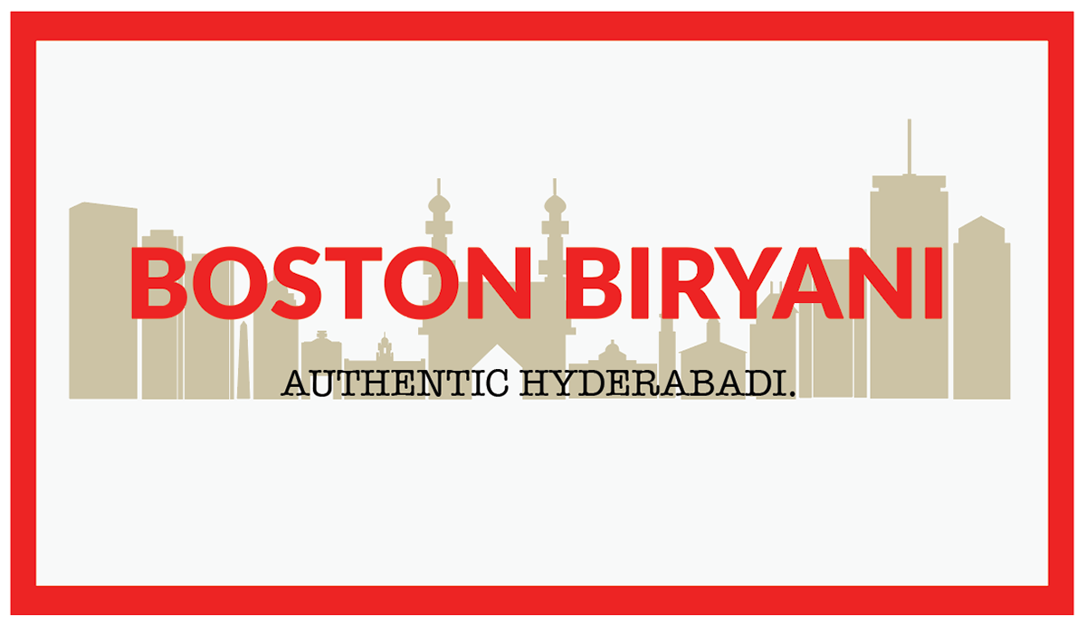
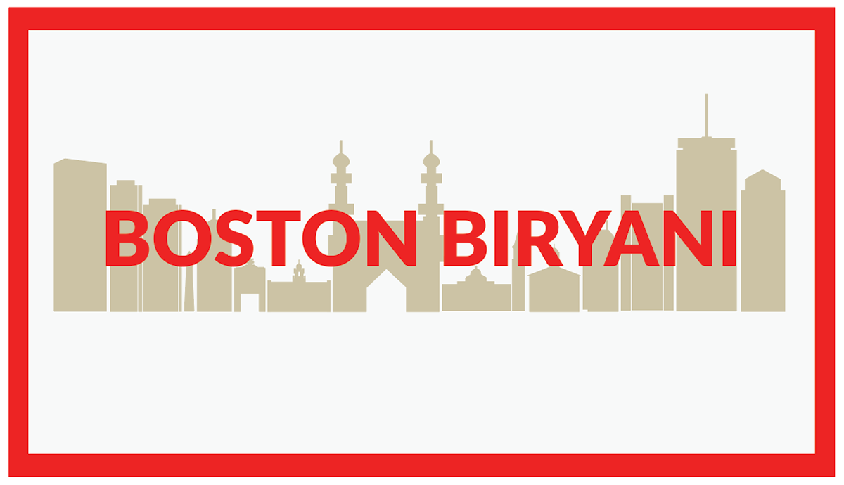
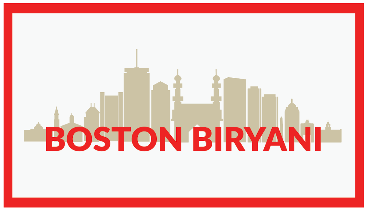
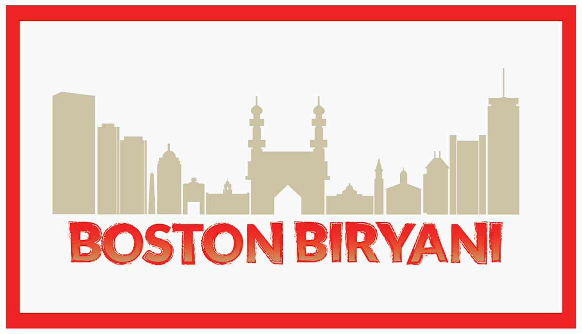
Then came the iterations. With my colors, imagery, and fonts mostly decided– I got to work creating many varieties while keeping a similar structure. And, believe it or not, there were even more variants than this, but I chose my top 6 to share with my client as to not overwhelm them.
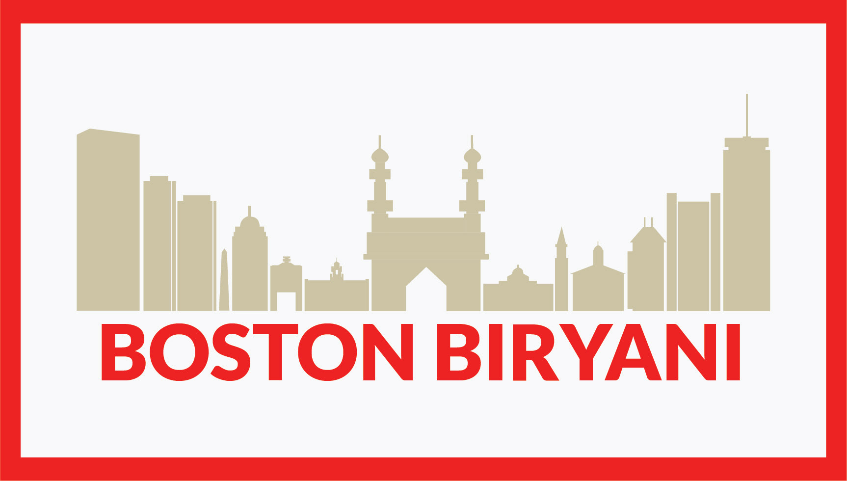
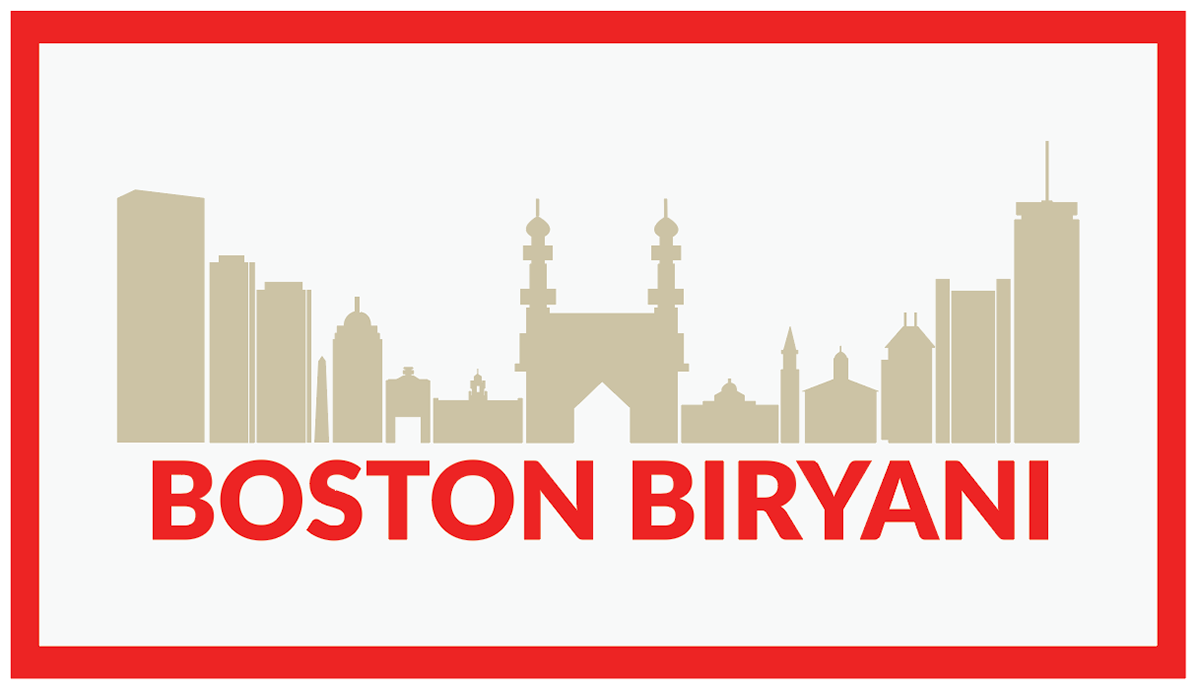
After some back and forth, revisions, and a tiny bit of crying (just kidding, it was more), we finally settled on our final full size logo. Keeping it simple and neat but still recognizable.

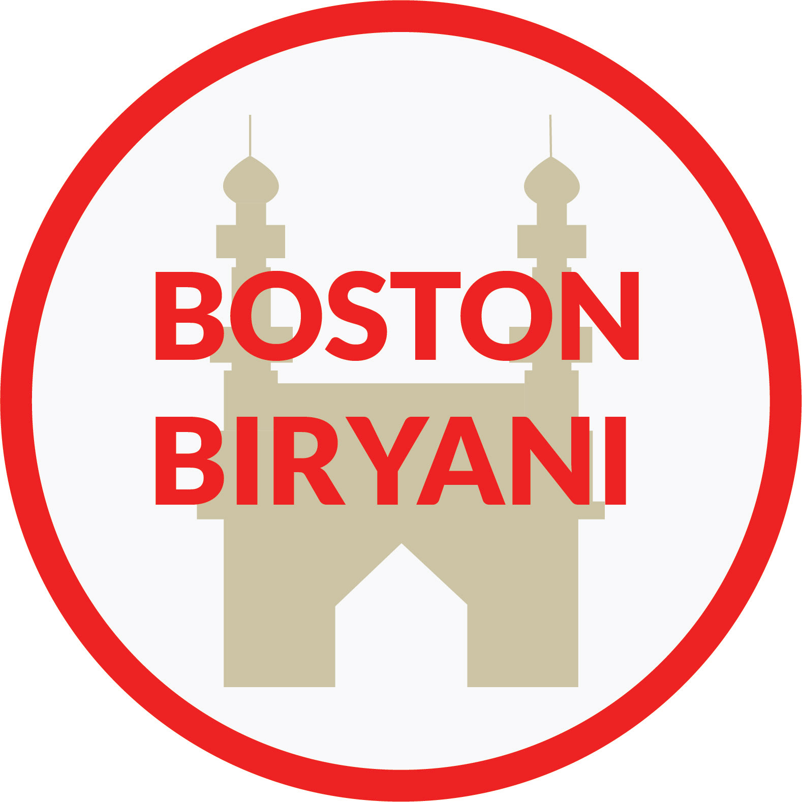
From the finalized logo, I was able to quickly pop out some smaller logo variants for social media/letterheads. This time keeping the soul of the new logo, but also simplifying it further.
After everything was polished and packaged, I sent it off to my client, who was more than happy with the results.