One of the first projects I took on after graduating was a logo redesign for Swanasa Central. As an artist collective and advocacy group for specific minority communities (South-West Asian, North African, and South Asian), they reached out to me as a South Asian designer to help them.
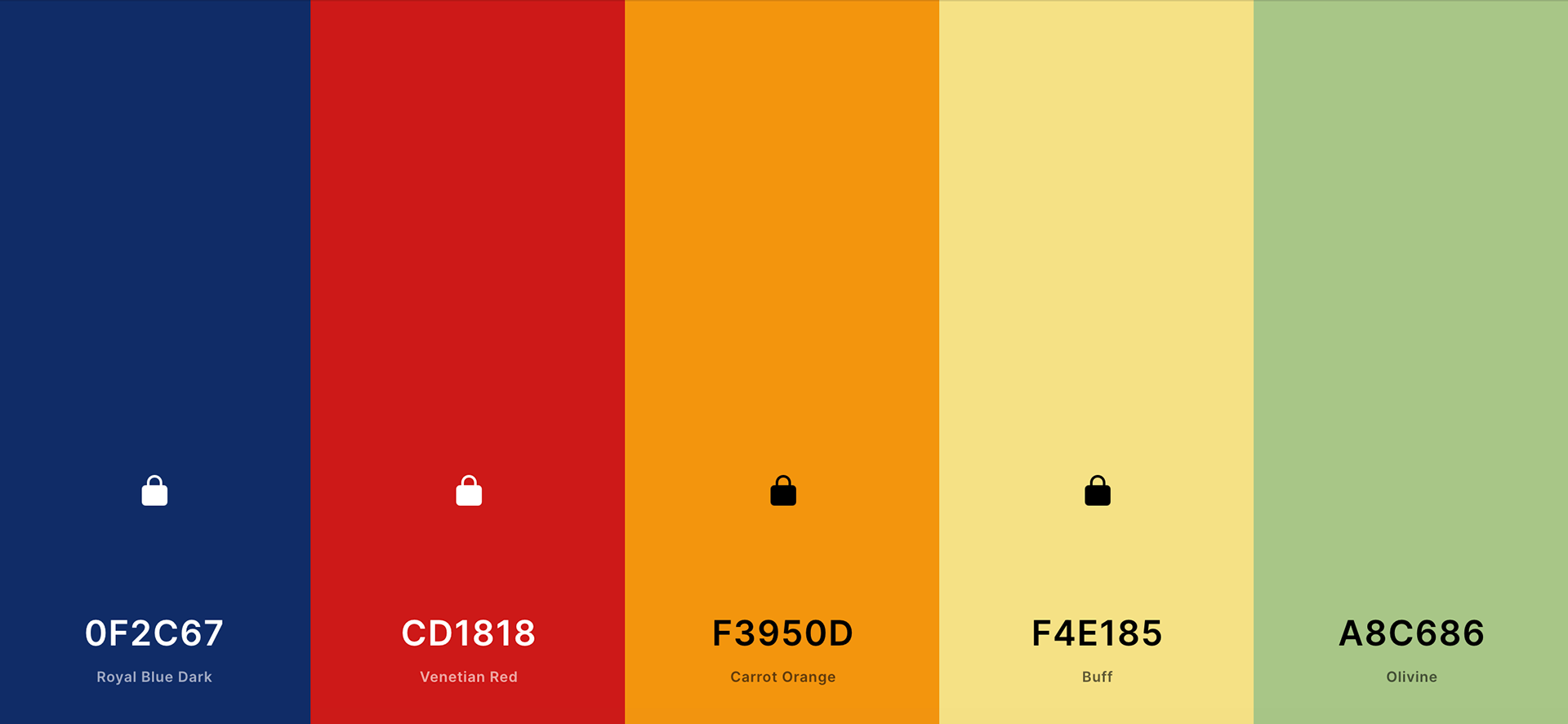
The first step in my process was to create a color palette that amplified the mission of the organization. I googled cultural images of each region and pulled a few colors from each, and from there I sorted them until I found 5 that complimented each other.
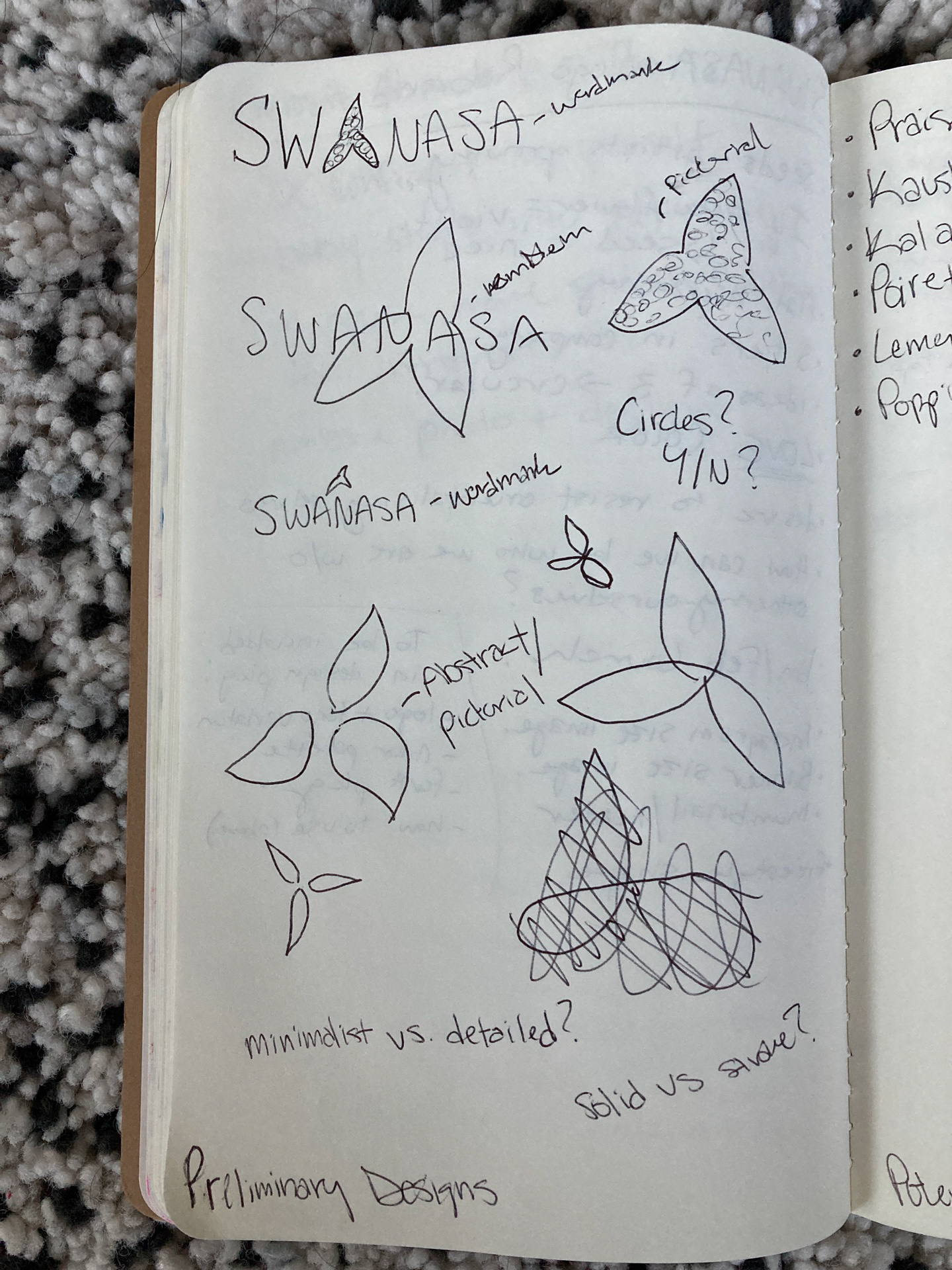
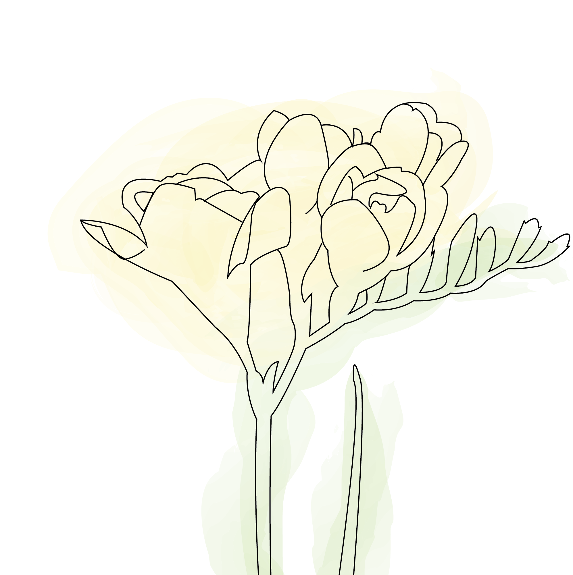
After finalizing the color palette, I began my sketches. My client wanted something that symbolized growth in artists, so we came up with the idea of using seeds. From there, I did my research in what type of seed could represent Swanasa best–and found the violet seed. The violet is the Illinois state flower, where Swanasa is based out of, and the seed has 3 prongs, which I decided could represent the 3 tiers of the company
(South-West Asian, North African, and South Asian).
(South-West Asian, North African, and South Asian).
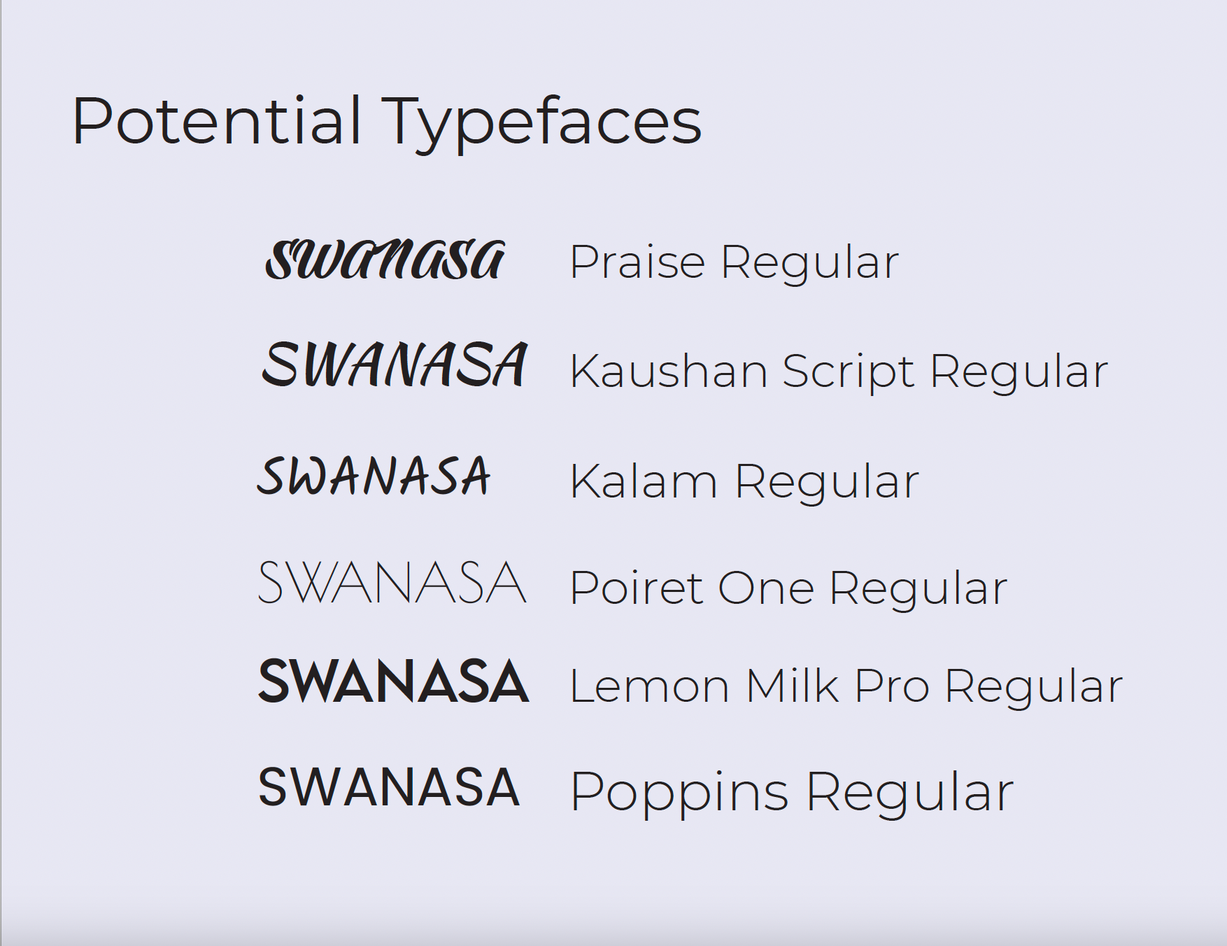
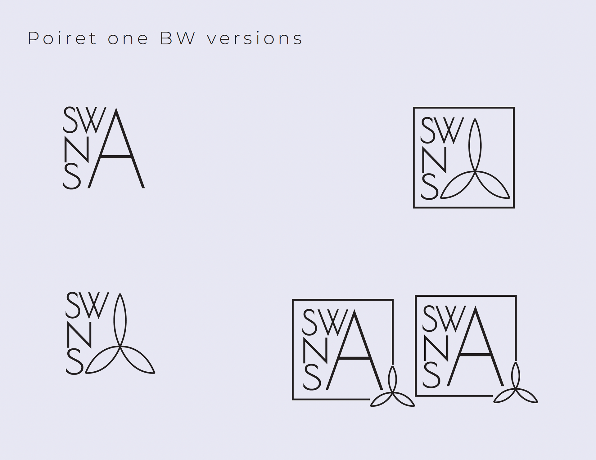
In my second meeting with the client, I presented the finalized color palette, the preliminary sketches, and the above typeface options. They wanted something modern and sleek that worked for their brand. Together, we narrowed the list down to Poiret One and Lemon Milk Pro to move onto the next step of the process.
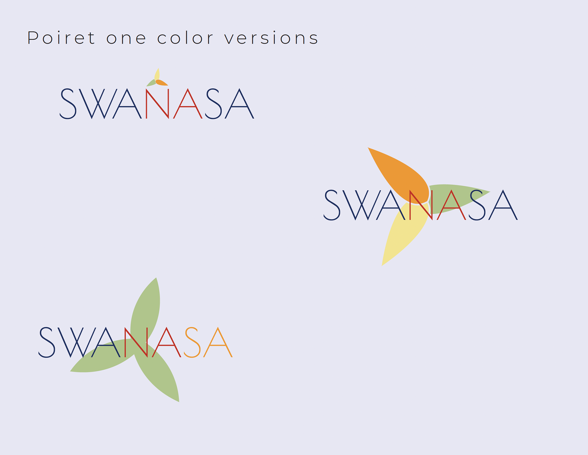
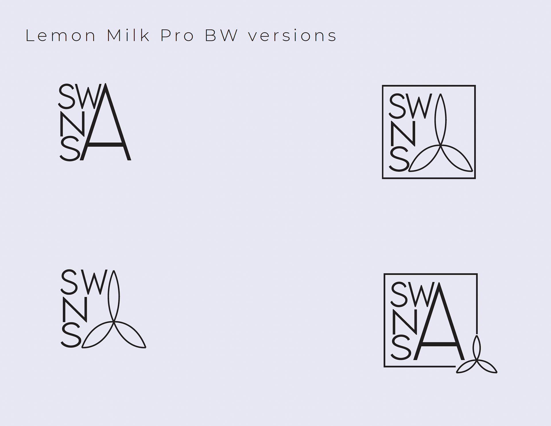
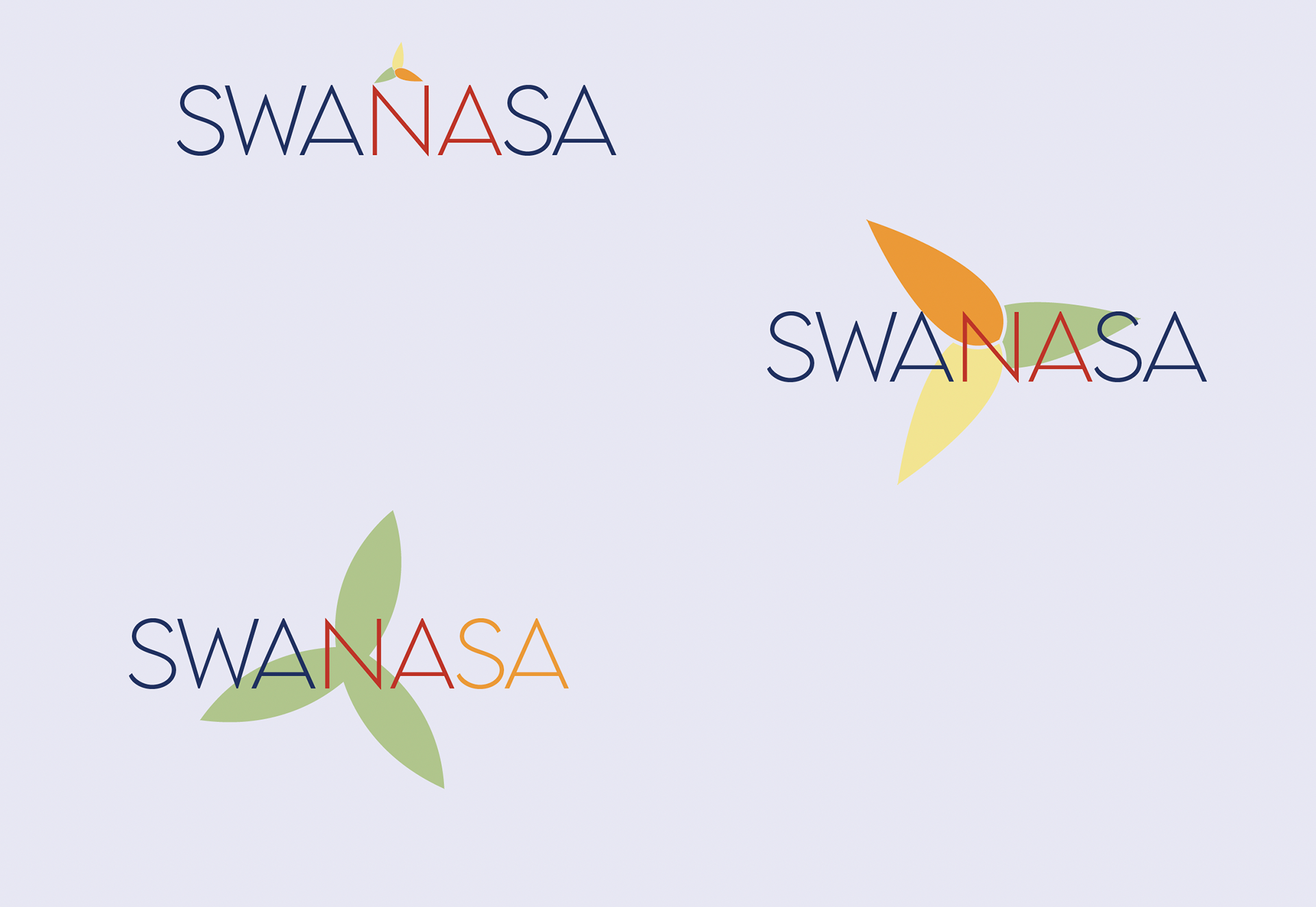
I digitized my sketches and made further variations, this time with the color palette and the two typeface options. Ultimately, we ended up choosing Lemon Milk Pro as it stood out better against the seeds.
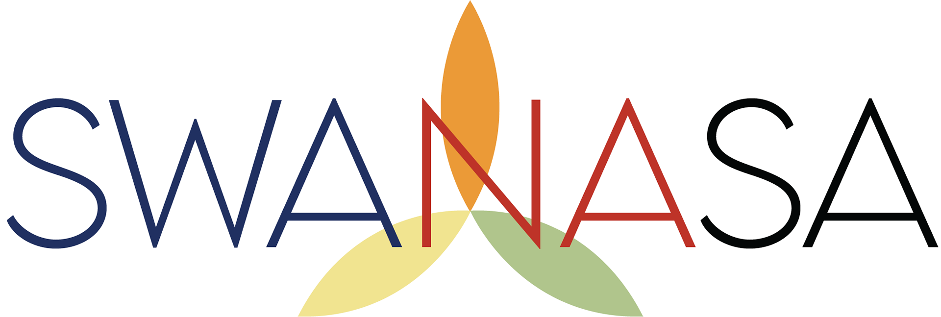

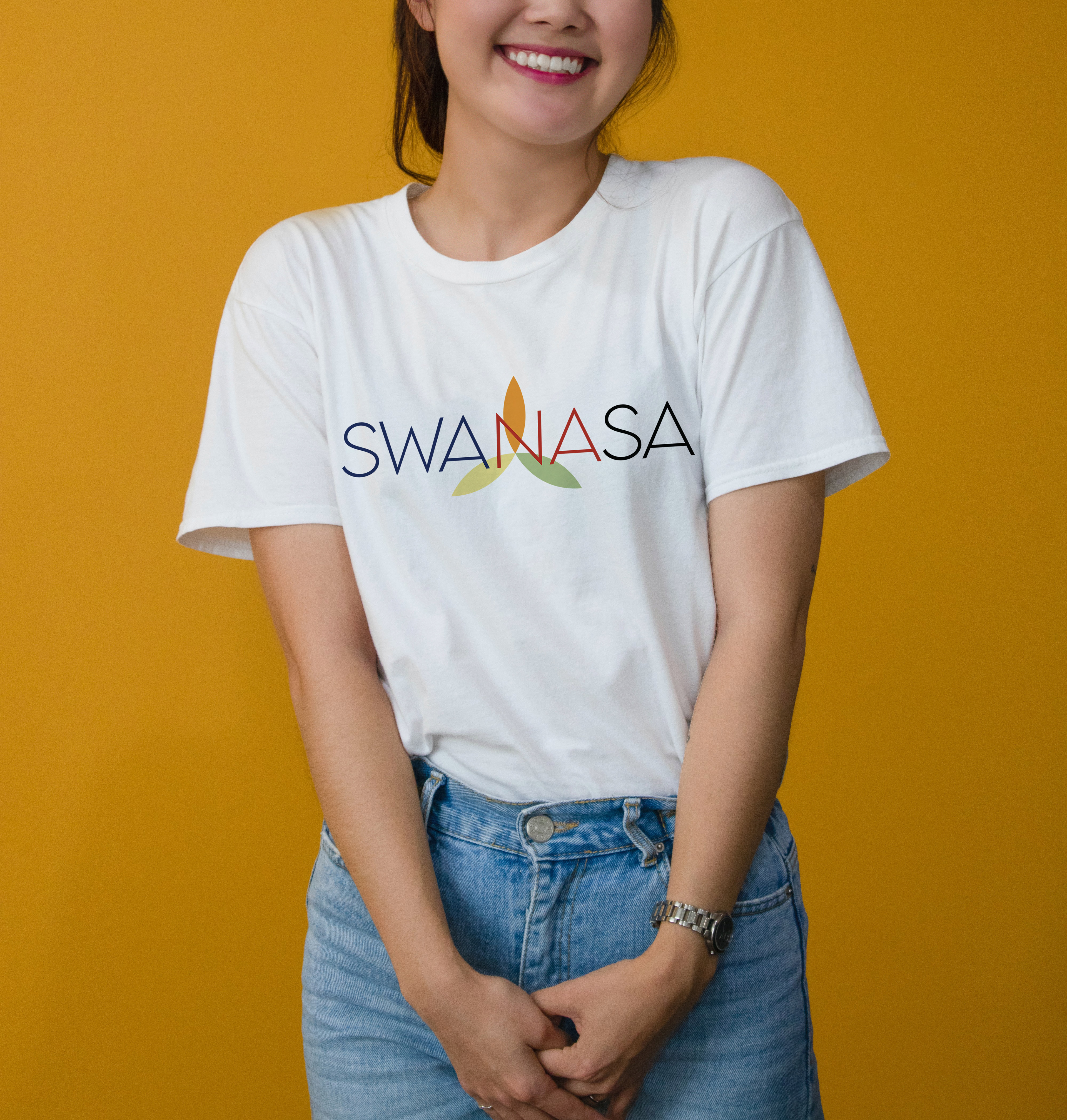
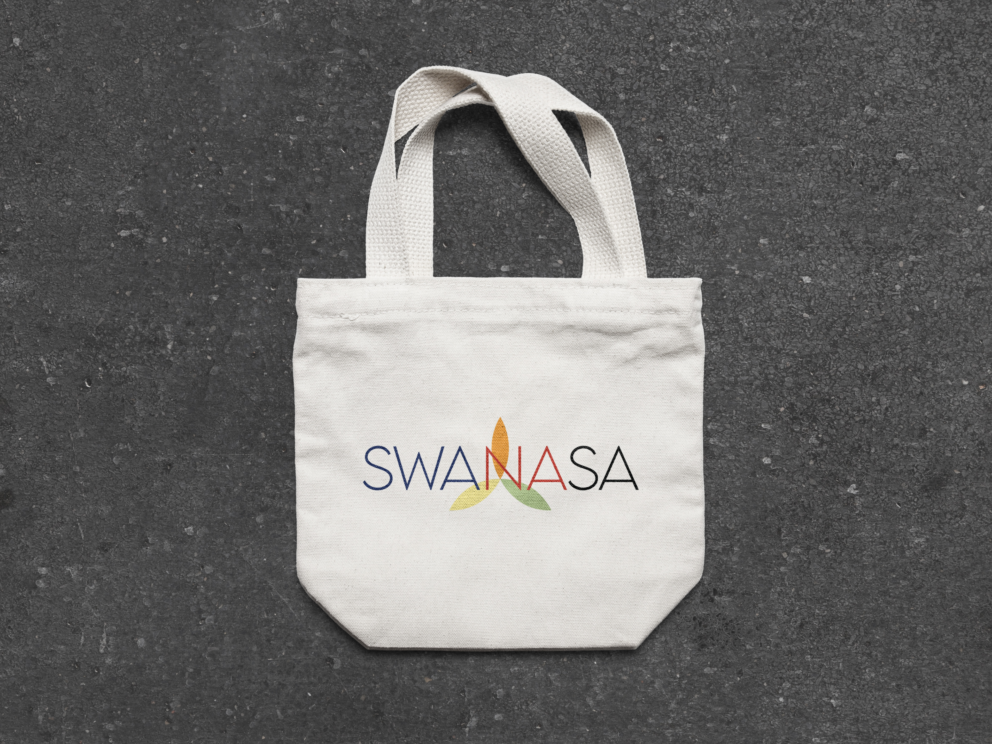
After weeks of meetings and revisions, we finally reached the end of the project. I gave my client final logo files, jpegs, pngs, pdfs, and I threw in a style guide for anyone that needed to know how to use the different components of the branding.


I'm incredibly grateful to have worked on a project with an organization that echoes my own values as much as Swanasa did.
For more information on what Swanasa and what they do,
please head over to https://swanasacentral.org/
For more information on what Swanasa and what they do,
please head over to https://swanasacentral.org/